Dragon Con Continues to Evolve With New Logo
Last year Dragon Con made some big changes, including eliminating the asterisk from its name. At the time this slight ‘name change’ – which probably should have been the least controversial of the convention’s changes – caused an uproar with both long-time and newer attendees…but it’s been about a year now and they’ve stood their ground regarding that pesky asterisk. I for one agreed with them that turning “Dragon*Con” into “Dragon Con” not only makes it “easier for reporters and editors to write about Dragon Con by eliminating questions about usage”, but that “a consistent spelling of the name [makes] searching for stories about Dragon Con on…the Internet” easier as well.
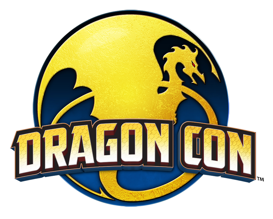
And even now Dragon Con – which is the largest event of its kind on the East Coast – is still working to improve their (for lack of a better word) ‘brand’. Just today they sent a press release to 2014 Press Badge holders about their fresh, “modernized” new logo…
President Pat Henry stated that they wanted to create a new logo that “honors our past, but also gives us something that represents Dragon Con’s present and future.” While yes, the design is a sleeker and simpler, I think that the bright colors and continued use of a dragon as the main symbol harken back to the old logo just enough, and personally I’m as big a fan of this change as I was of them getting rid of that asterisk.
I’m sure that many Dragon Con fans will have quite a bit to say about this change – after all, it’s the first time in twenty years that the convention has updated its logo! Do you think that the new logo will “stand the test of time” and symbolize Dragon Con becoming a convention that is “embraced by the mainstream culture that encompasses so many aspects of fandom,” as Henry hopes? Leave your thoughts in the comments!
Author: Tara Lynne
Tara Lynne is an author, fandom and geek culture expert, and public speaker. She founded Ice & Fire Con, the first ever Game of Thrones convention in the US, and now runs its parent company Saga Event Planning.
Help support independent journalism. Subscribe to our Patreon.
Copyright © The Geekiary
Do not copy our content in whole to other websites. If you are reading this anywhere besides TheGeekiary.com, it has been stolen.Read our


I dig the new logo. It’s sharp and simple, and easy to read at a glance.
That banner ad is atrocious, though – looks like the cover to a bad slash eBook on Amazon!